To create an effective website, it is essential to understand these ten principles of good web design. We discuss ways to help you create a website that engages your audience and makes it easy to use.
By following these web design principles, you can create a high-quality website that provides a great user experience and meets the needs of your target audience. This article will discuss 10 of the essential principles of good website design.
How Humans Engage With The Web
Easy navigation is a top priority on most websites, and search engines are the primary means of navigating online content. When users search for something, they do so by typing in a word or two that best describes their interests.
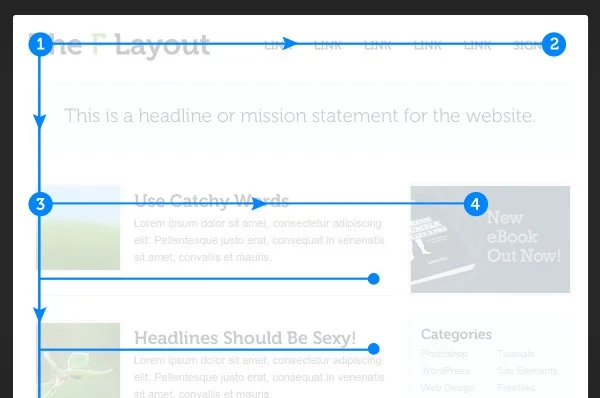
Users don’t read web pages. They scan them. Readers who visit a webpage check the page rather than read it entirely. They seek out specific vital points, or anchors, to help them understand the page’s content.

People don’t read every word on a page and prefer to scan for the main idea and skip around for details. It is essential to ensure that your website is viewed correctly by those who visit it.
Most web designers will design your website with adequate screen sizes to be more visually appealing to viewers. It will also ensure that users interact with your website more prolonged than usual.
Users are impatient and want to be satisfied quickly. If a website is able to fulfill your expectations, then the designer has succeeded in his job. The more steps you go through to find what you’re looking for and the more cluttered the layout, the more eager users are to leave the website and search for alternatives.
Users only sometimes make optimal choices. Users only sometimes use search engines to find the most relevant content they are looking for. Instead, they scan a website’s pages, going from one section to another.

1. Don’t make it difficult for users to accomplish tasks.
When creating an effective web design, you should strive to eliminate any questions in the navigation and architecture. A clear structure will help users find their path easier through self-explanatory links easily recognizable by sight or sound; this also keeps things simple for designers and visitors!
If your navigation and site architecture aren’t intuitive, you’ll get more question marks from users. Clear structure, moderate visual clues, and easily recognizable links make it easy for users to reach their goals.
2. Avoid confusing users
People prefer easy accessibility. They want readily available information, which is why it is essential for People who like things that are easy to access; they choose readily available information.
To make the most of your usefulness, could you include attention-grabbing call-to-actions on your website and convert navigational links into opportunities for communication, using headline sentences and sub-headlines, bullet points and catchy phrases instead of longer sentences?

Users won’t use your website if they find it confusing; to avoid this, your designer will use hick’s law to recommend the best possible navigation system. Consider your customers’ needs when designing a user-friendly site; it will help boost your traffic and revenue.
3. Keep Your Users’ Attention
The importance of infographics, graphs and videos should be considered when creating a website. These essential elements can help balance out the white space with negative spaces by providing high-quality, user-friendly content!
Colour creates balance and harmony. Contrasting colours that fit the background and lettering will be pleasing to users. Proficient designers use colour, contrast, and visual hierarchy to create compelling designs.
4. Mobile Friendly
These days, most people are accessing websites on various mobile devices, and people are now more likely to access websites from their phones than their computers. To be accessible to the most significant number of people, ensure your website looks good and functions well on mobile devices.

5. Use Writing Styles To Engage Readers
If you want your writing to be read online, it must be written differently from how you would write for print. If the Web differs from the pattern (and it is), then you need to adjust your writing style to accommodate users’ preferences and browsing habits.
Use active voice where possible, making your writing more engaging and powerful. Write for your audience, not yourself. If you’re writing for others, certain things will resonate with them more than if you were writing for yourself alone! This means that your tone should be friendly and approachable.
6. Aim for Simplicity
Simplicity rules in good web design. A clean, fresh design makes a site easier to navigate and more aesthetically pleasing. Business websites should be kept focused; avoid unnecessary features that don’t serve a purpose or make it harder for your users to get things done.
Visitors to your website will look for visual cues that help them find the information, products and services you offer. A design element can be explicit—such as arrows or links—or very subtle. The placement of these visual elements is critical in enticing visitors to take the desired action and making the site easy to read.
7. Use White Space
When you design a site, please leave room for your content and images. Without white space (commonly called “negative space”), your page can get cluttered and hard to read.

9. Visual hierarchy keeps navigation simple
The visual hierarchy of your site’s navigation should make it easy to access your content in just a few steps. Of course, you don’t want any content to be missed, but endless dropdowns, buttons, and internal links will overwhelm people.
10. Authenticity creates trust.
Good design is honest. It does not make a product seem more innovative, powerful or valuable than it is, and it is not manipulative.
Cliches and vague marketing copy won’t help you connect with people. Position yourself as a voice of authenticity by providing information that has value.
Enjoy The Process!
As in any creative practice, you can only abide by these principles sometimes, but keeping these guidelines in mind can help you avoid some common mistakes in your quest for successful web design.
At Ashbi Creative Studio, we understand clients have different needs, goals and objectives. So, we’ll ensure we provide the best services to help you achieve your business needs. Our web design services are tailored for every individual client.


